My students frequently mix up my $t$'s with my $+$'s and my $y$'s with my $4$'s.
What is a good handwriting font for distinguishing these and other easily confused symbols?
My students frequently mix up my $t$'s with my $+$'s and my $y$'s with my $4$'s.
What is a good handwriting font for distinguishing these and other easily confused symbols?
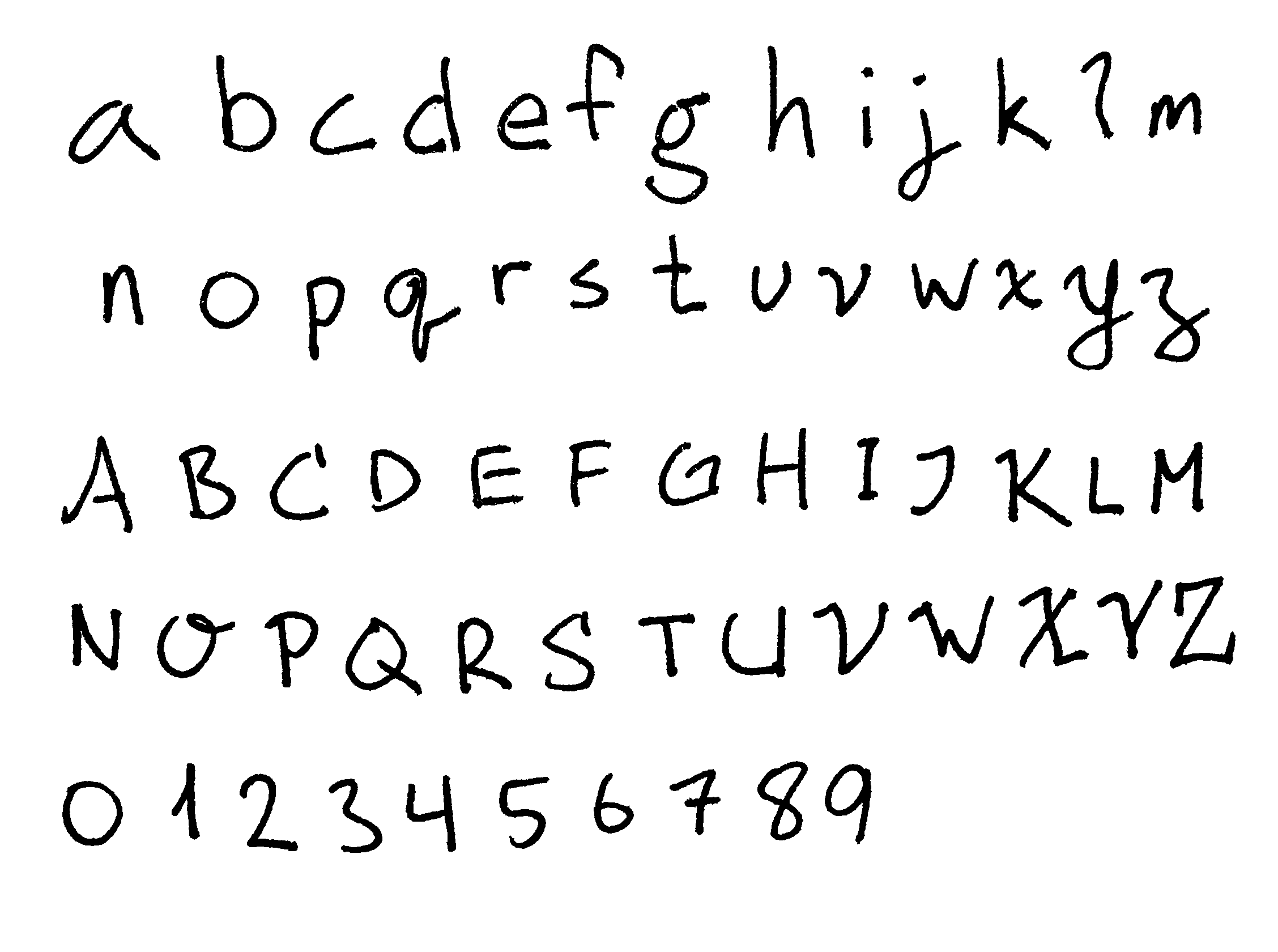
I changed my handwriting font years ago for precisely this purpose, and I have continued to tweak my letterforms over the years, using the algorithm of changing the form of whichever letters seem to generate the most confusion. Here is my current font:

A few notes about these letters:
Capital letters aren't listed, but my experience is that they're all fairly straightforward. Just make sure to use print letters instead of cursive.
It's crucial to have versions of a, b, d, p, and q that can be written using a single stroke. If you draw your circles and stems separately, they will constantly get disconnected, which vastly decreases legibility.
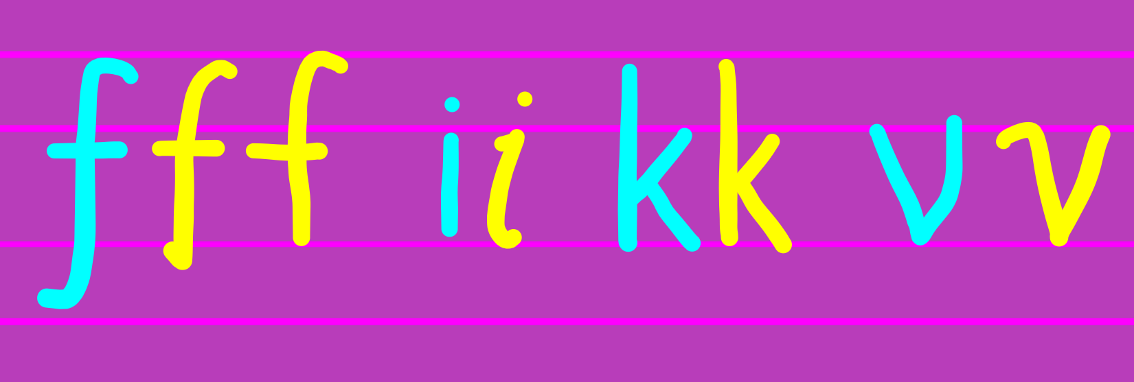
I often omit the bottom "tail" on the f when writing it in the middle of a word, but I always include it when it's part of an equation. Similar statements hold for the top curve on the i. I will also draw a 1 as a simple vertical line if I think it's clear from context.
The l (ell) is my newest letter, and I'm not really sure about it yet. I tried using a cursive $\ell$ for a while, but it never looked good inside of words, and it still wasn't very legible as a variable. At present, I am often omitting the top and bottom curves when the l is part of a word.
In general, I've had bad experiences with vertical loops. I've tried loops on $\ell$'s, g's, j's, d's, and q's, and all of them seemed to make the letters less recognizable. (This is probably because such loops hardly ever appear in computer or typewritten fonts.)
The tail curve on the t is crucial to avoid confusion with a + sign.
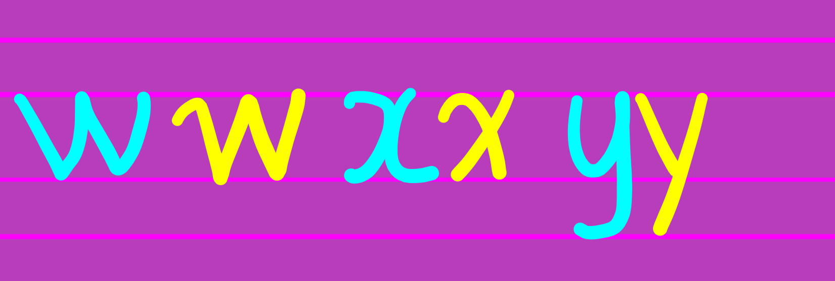
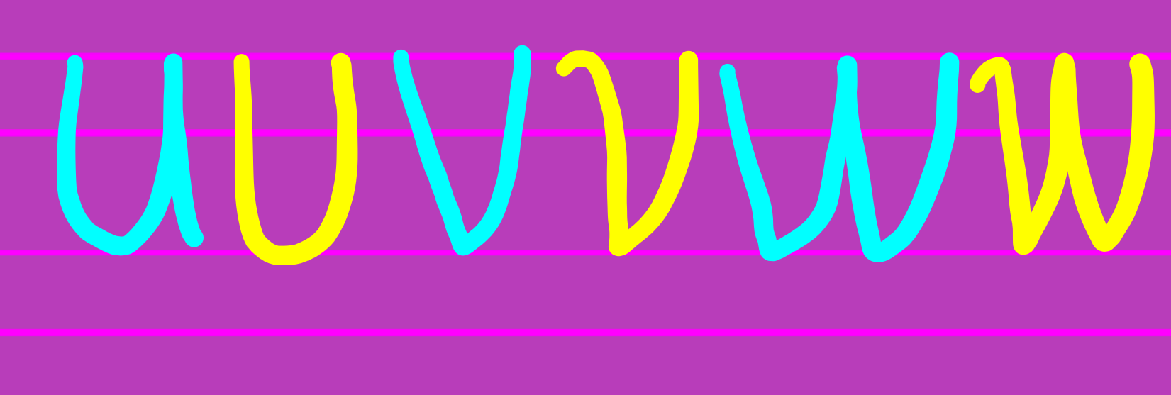
The initial curves for the v and w are quite helpful for legibility. I also think v's and w's are more legible with relatively sharp angles, as opposed to a curvy cursive approach.
The initial curve on the x is absolutely essential. This will be one of your most used letters, and it really helps to get it right. Curves on any of the other three stems don't seem to improve legibility, and make the letter annoying to write.
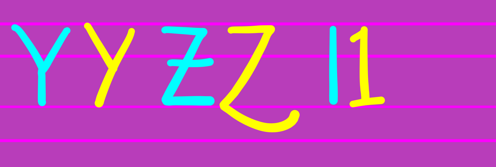
I also think this curvy version of a y is easier to read than a two-sticks version. Among other advantages, it can be drawn in a single stroke, which avoids disconnection problems.
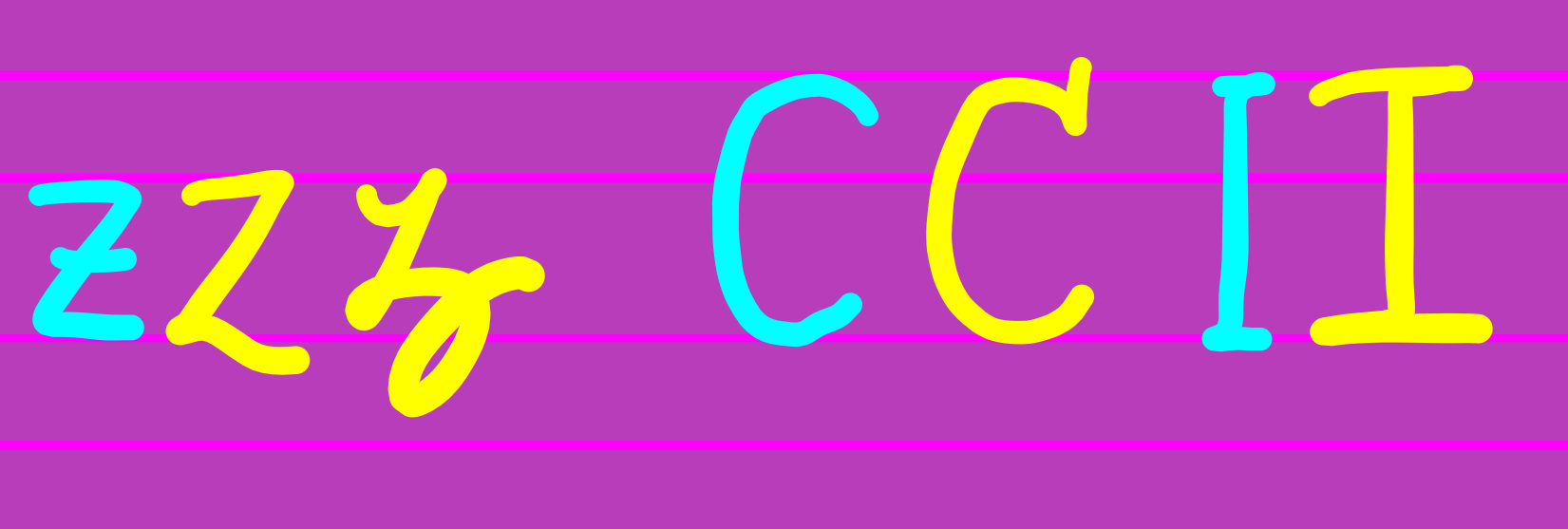
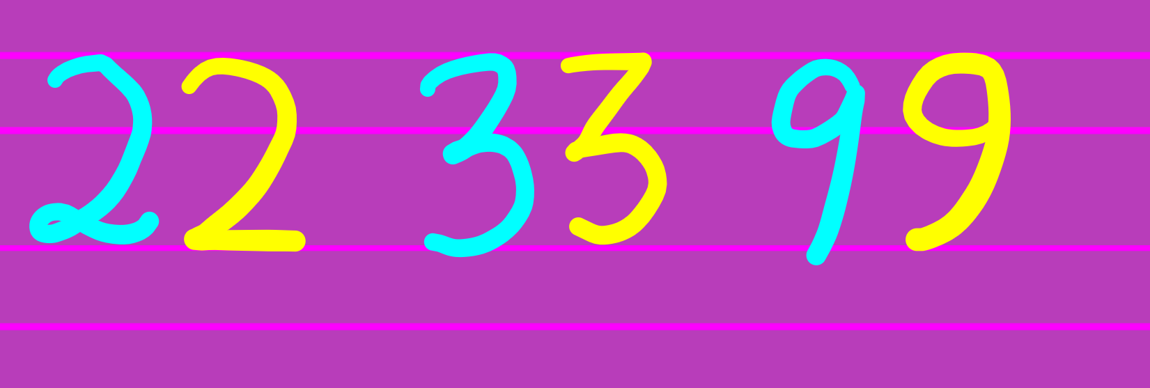
The line across the z helps avoid confusion with the number 2, and the line across the 7 helps avoid confusion with a variety of symbols.
I don't seem to be able to draw a curvy-bottom 9 that looks good. I wish I could.
This version of a 2 is much clearer than any version with a loop on the bottom.
I tried drawing a final loop on my o's for a while (like a cursive o), and it didn't work out.
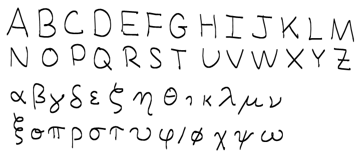
Edit: By request, here are my capital letters. Unlike my lowercase letters, my capitals are really quite standard, and I don't have much to say about them. I've also included by Greek letters.

$\times\ \ +\ \ 4\quad 2\quad \omega\quad 9\quad a\quad 1\quad i\\ x\quad t\quad y\quad z\quad w\quad g\quad q\quad l\quad j$

Here are what my alphabet and numbers have ended up looking like. For the sake of clarity, I've included a stroke order chart, where the first stroke is red, the second green, the third blue, and the fourth cyan.
I try to make distinctions between every character, but I agree with those above who have noted that "o" is, in general, a terrible name for a variable. I tend to only use the "O" with a flourish where I have to make a distinction between "o" and "O".
I use the double-story "g" to distinguish from "y", and "S" with a serif to distinguish from "5". I use serifs to distinguish between uppercase and lowercase ("c" and "C", "s" and "S", "k" and "K", "v" and "V", "w" and "W", "p" and "P"), but where I don't have to make that distinction, "c" and "s" get serifs to distinguish from "(" and "5", respectively.
I would like to add a point that I've not seen explicitly mentioned in the other answers. That is that context can often be your aid in clarifying your lettering. As a trivial example, no one is going to misread they as +hey. So the "special alphabet" is primarily for mathematics in your lectures. (That said, you should cultivate a clear hand writing for normal text but it doesn't need to be as extreme as for the mathematical part.)
Similarly, if you never write $\times$ then the students will soon realise that x means $x$ and not $\times$. And I doubt that someone will mistake $x_k$ or $\vec{x}$ for $\times_k$ or $\vec{\times}$.
On the other hand, scale is often hard to see on a board so X and x are not easy to distinguish. It can be awkward to avoid using these together (consider the common desire to have $x \in X$) and distinguishing them visually can be difficult, but then context can help.
Here are some practical tips:
Go in to a large lecture hall, write some random equations on the board, and then go to the back and try to read what you wrote. Then modify your handwriting until you think it is clear. This won't be perfect (since you know what you wrote), but it'll at least be a lot better than not doing it.
Say what you write as you write it, and make sure that before you write anything on the board then the students are at the same point as you so that they are paying attention to what you say as you write it.
Cultivate writing "the wrong way". It's a bit trickier for those not blessed with sinister tendencies, but if you can learn to write so that you do not stand in front of what you just wrote then it will be much easier for the students to see what you write as you write and say it. This doesn't mean writing with your left hand, it is possible to do this with the right hand but the body position takes a bit of getting used to. This has the added bonus of making you more turned towards the students as you write.
Having just given a lecture, I'd add one more practical point: ensure that the board is clean before you write on it. Stray squiggles left over from before you erased it can be confusing.
This is my handwriting font for mathematics. (Excuse the shakey-ness, this was made using the stylus on my phablet.)
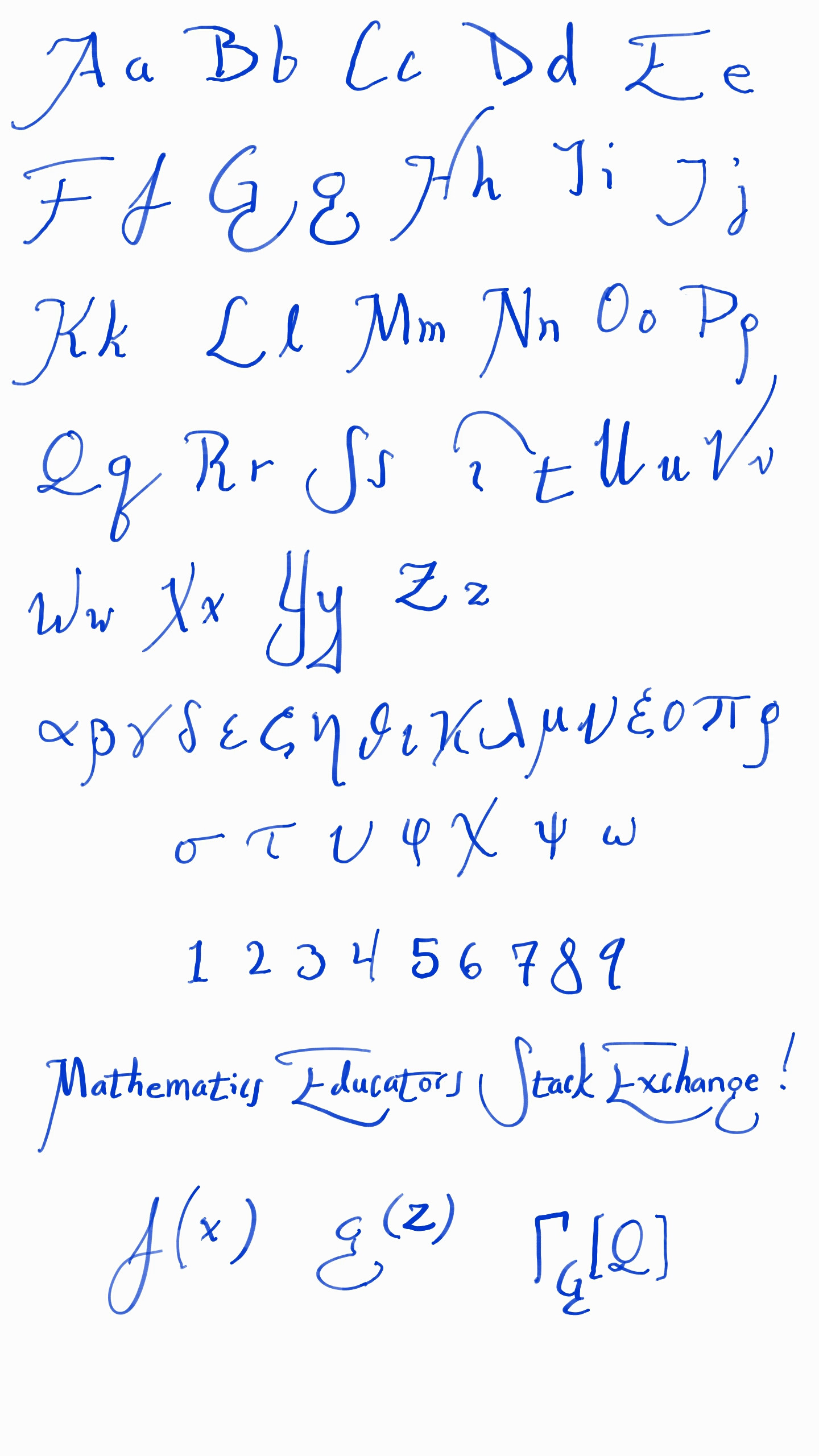
It isn't as minimalist as some of yours, but I have never had anyone tell me they had trouble reading my writing. I make it clear which letters are which by using size and giving attention to negative space.
I find that using big loops and serifs is really good for board work, where it can otherwise be difficult to distinguish capital letters. (Spencerian cursive is actually pretty good for board work too, just not for equations.)
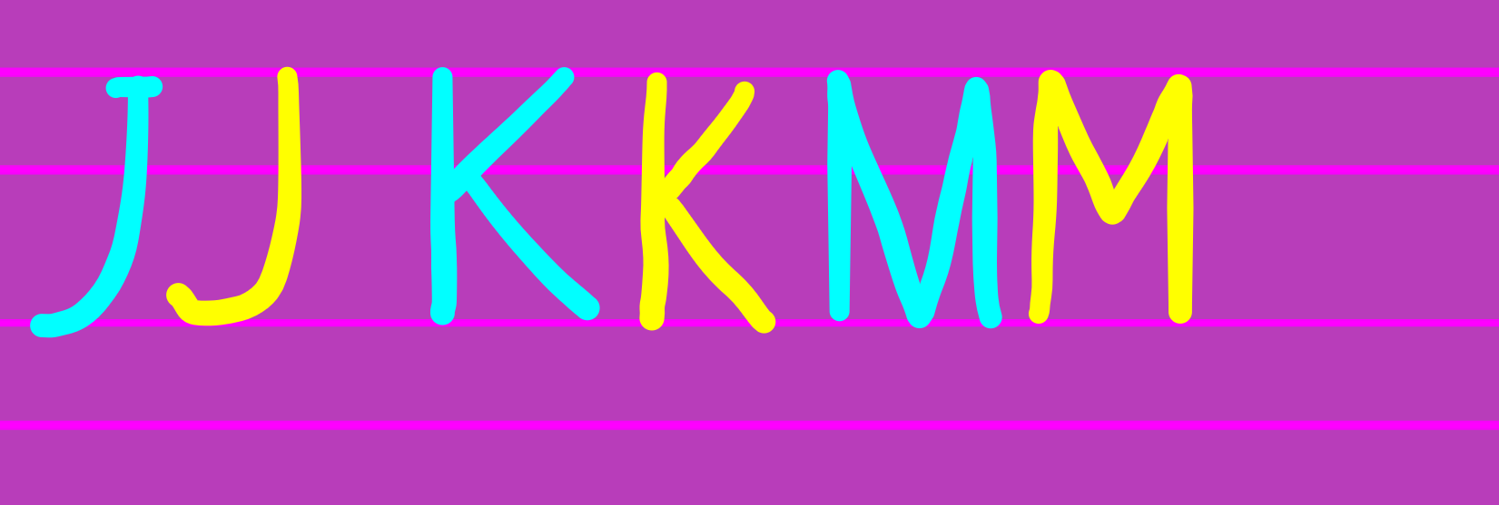
The prototypical gesture here is the J, from left to right to down. That is the leftmost part of many capitals.
Keeping track of where the bottom line of the word is also important, for example the tail on the lower case t is just below thst bottom line, and it is crossed exactly on the middle letter line.
My biggest problem is that my vs look like nus.
I think you need to fix any problems you have by modifying a letter or two of the way you write. For example, I used to write my y's in two separate straight strokes, but they would get confused with my x's if I wasn't careful about where the stroke stops. To correct this, I started writing my y's more like the way you write a g, with a curly bottom. I also stroke my z's with a cross to keep them separate from my 2's.
To fix your t's, add a curl on the bottom.
As others have suggested, adding a serif can make a big difference. I write my y's like g's, and I also stroke my z's through the middle. Lower-case l's are written cursive-style, with a loop, and I make sure to make the 'tail' of my q's big enough to ensure there's no confusion with 9's.
I also never use certain letters as variables (if I can help it) - especially o's.
In response to Chris Cunningham's request, I think this sort of 5 is unlikely to be mistaken for an s:
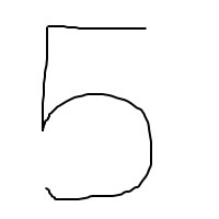
The key is not just the right angle at the top left, but the sharp angle directly below it. The danger here is to make sure you don't come so close to closing up the bottom that it looks like a 6.
We discussed this, or more specifically the subject of handwritten $x$, a while ago at The Aperiodical.
I still don’t understand why the two-curves $x$ never caught on in the US. Newton wrote $x$ the way modern Brits do, so it predates American independence. Curious!
Taking my cue from printed math (and particularly TeX), I use different fonts for text mode and math mode. The italic font (math mode) is cursive, while the roman font (text mode) is printed. This helps distinguish ‘a’ from ‘$a$’, for example. (And assuming that you and I are both using the default fonts on this site, then my handwriting looks pretty much like those two letters do on the screen.) When I started this, I had a somewhat too exaggerated cursive style, so the fonts look less different now than they used to, but I maintain a difference in all letters.
Also, after several false starts, I've settled on a little loop at the top of ‘0’ to distinguish it from ‘O’. (Much as TeX uses merely slanted letters for math-mode capitals, I don't distinguish text-mode and math-mode capitals at all, saving the fancy cursive stuff for calligraphic font, which I use only in extreme circumstances.)
I write like this:
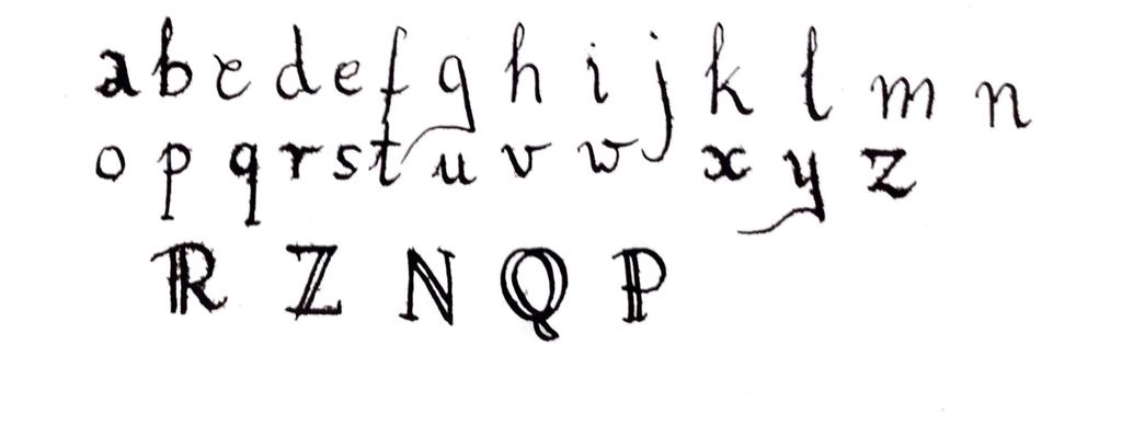
And everybody can read what I'm writing. Especially, take look at letter x.
And here are my digits:

How about using cursive handwriting as shown below:
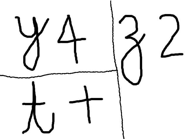
The key is neatness. I am a student, and I take for granted that my lecturers will use neat handwriting. I don't like it when a lecturer's handwriting is scrawled hastily and messily because it makes it difficult to read. I also don't like it when a lecturer neglects to write down something they have said, or something that is helpful with understanding what is being communicated (e.g. writing "Proof" before a proof to let the class know that the theorem has ended). Below I have given some pictures of the best handwriting that I have encountered.
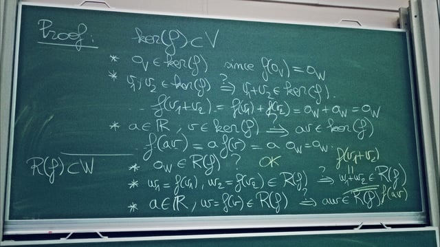
Picture 1: this lecturer gives a tail on his v's and w's. The only problem with this handwriting is that the difference between a u and a v can be confusing.
The following two pictures show writing done by a lecturer who is exceptionally neat when he writes on the board. His style of teaching is to have a lot of discussion, and to only write down the mathematical symbols which he is talking about.
One thing I have run into is, when learning or tutoring probability, being able to distinguish the random variables with their density functions' support.
To that end, I typically put serifs on my capital letters only, and that helps me tell the difference. One big issue is telling the difference between $W$, $w$, and $\omega$. I typically put serifs on $W$, keep the angles crisp on the $w$, and exaggerate the round parts for the $\omega$.
I tend to loop my ζ so it doesn't look like a Z and I also put the lines on the z so it is not a 2.I also make my 1 like shown in the picture so it is not an I. I make my lowercase g fancy so it is not a 9. I put lines on my Θ so they are not θs. I also make my α short so they are not a ∝. I do not make my Phis like a plain old circle with a line. I tend to make a loop and then come down. My μs have a loop on the side.
I don't understand how you can mix up a t and a +-sign:
t contains a curl at the bottom and the bar does not pass left of the vertical line+-sign consists only of straight lines.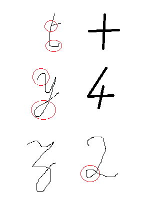
y starts with a curl and has a hole at the bottom4 consists only of straight lines.z is written in the French way, the hole is quite long.2 has a small but clear hole. Those of you who have been fortunate to see János Pach give a chalk-talk (or its electronic equivalent) will appreciate that his beautiful handwriting has been converted into a downloadable font by Luc Devroye:
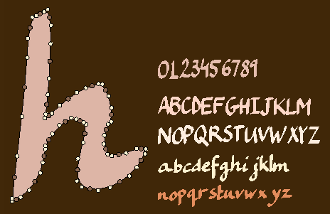
When doing density calculations students sometimes mistake my "Rho" for "P". Need to curl the stem a lot more to avoid this happening. Also when teaching hydrocarbon chemistry need to always make sure that my double and triple bonds are clear as sometimes the lines are not far enough apart and students mistake it for a single bond.
\rho and \varrho ($\rho$ and $\varrho$)? :P
$\endgroup$
Math handwriting is not always a challenge. You can always change things up.
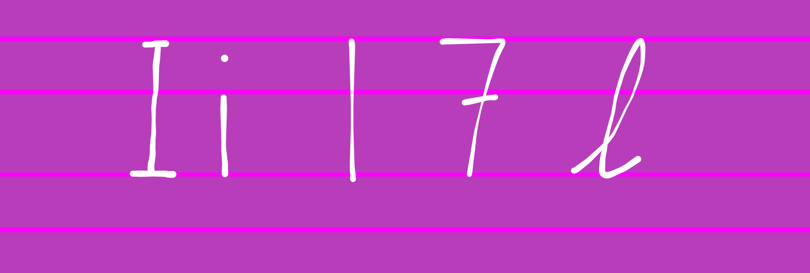 It's best to keep
 1 a straight line, and more importantly, add a bar to 7. And then, there's the letters I and i. Always put bars on the I and a dot on the i, obviously. The lowercase l is always tricky, and confusing, but using a cursive version always helps.
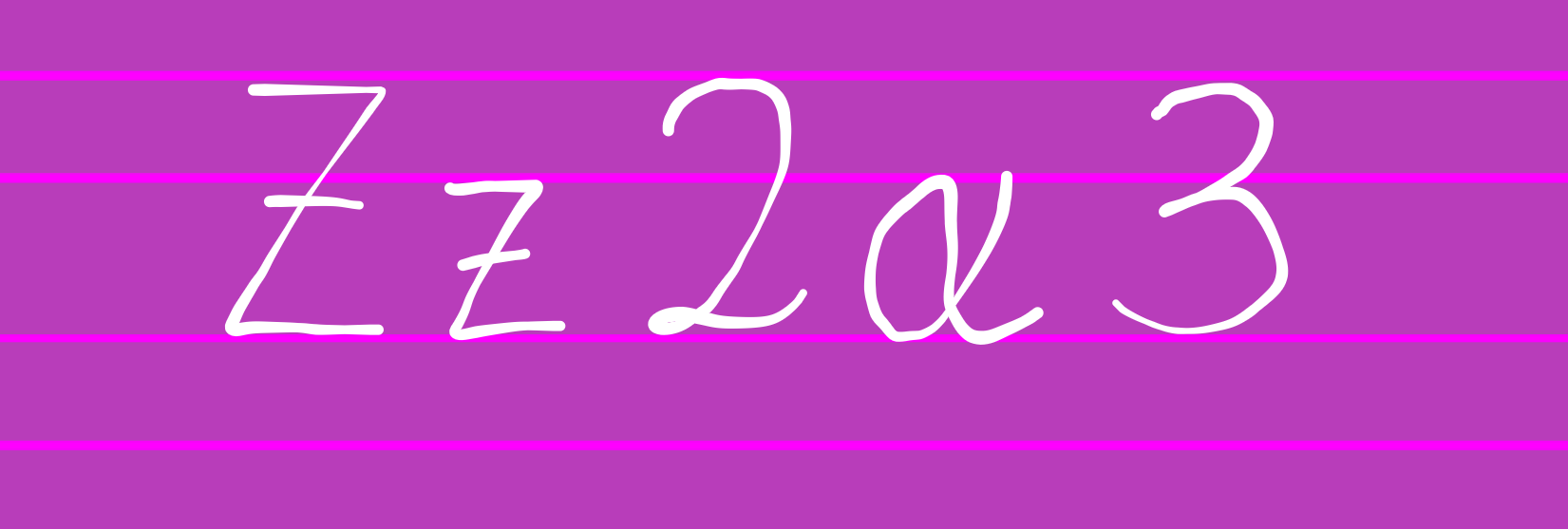 Next is
 2. 2 can maybe look like α and probably 3. Make the loop smaller on the 2, and don't add a loop to the 3. The 2 may look like Z and z, but crossing it makes it look different easily.
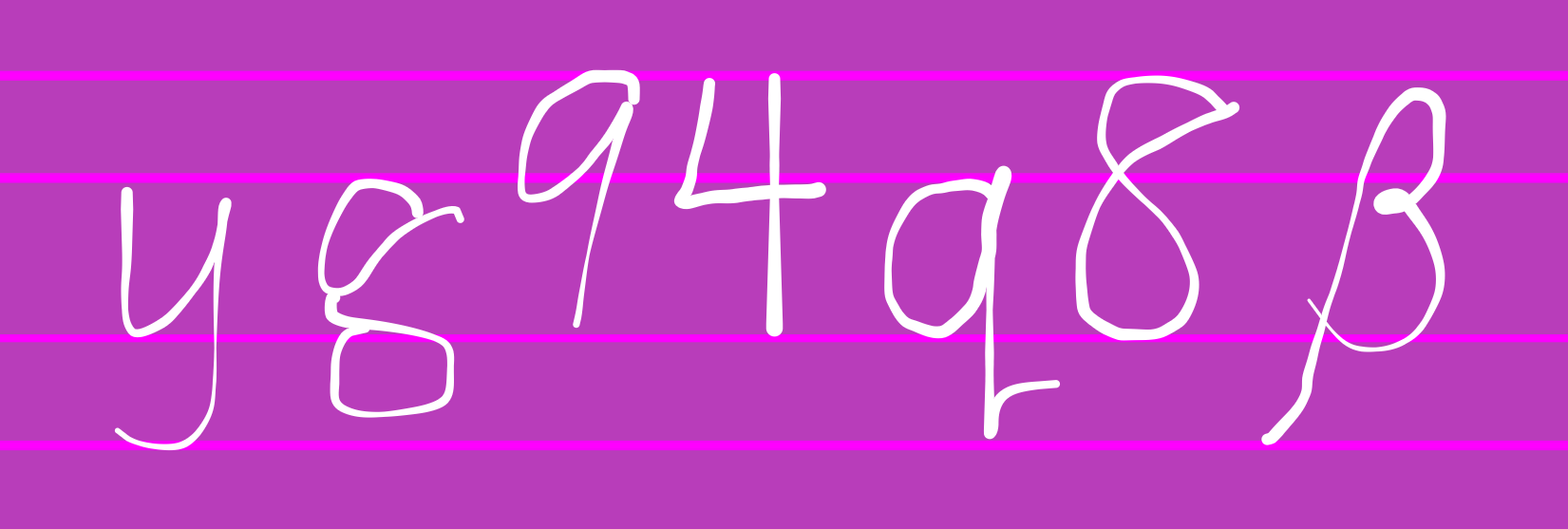 There's the numbers
 9, 4, and the letter q. Open the 4, and add a tail to q so it doesn't look like a 9. Don't add a loop to a q, it may look like 8 or β. Don't add a hook to the 9 because it may look like a single-storey g, and always make the g double-storey. It's probably best to keep the y curved.
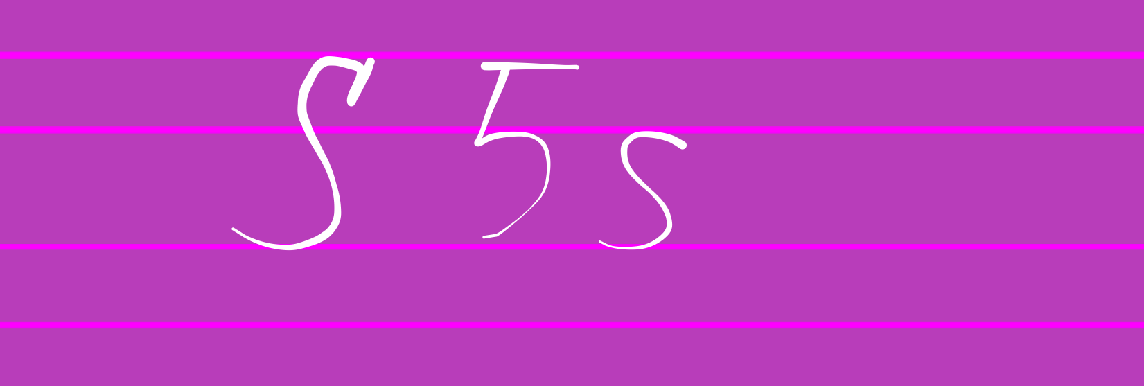 There's the number
 5 and the lookalikes S and s. Always write 5 with two strokes, add a serif to S, and make s smaller.
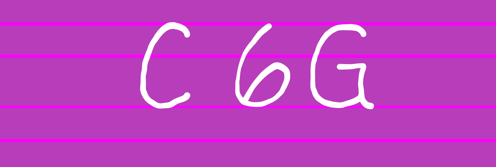 There's
 6, C, and G. Make sure to close the 6 properly and give a pointy end to G.
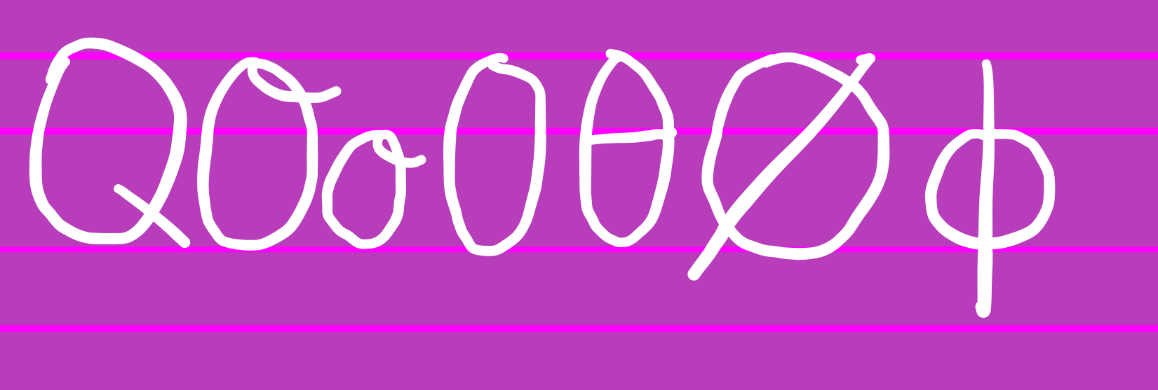 And worst of all:
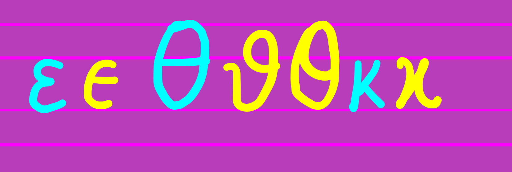
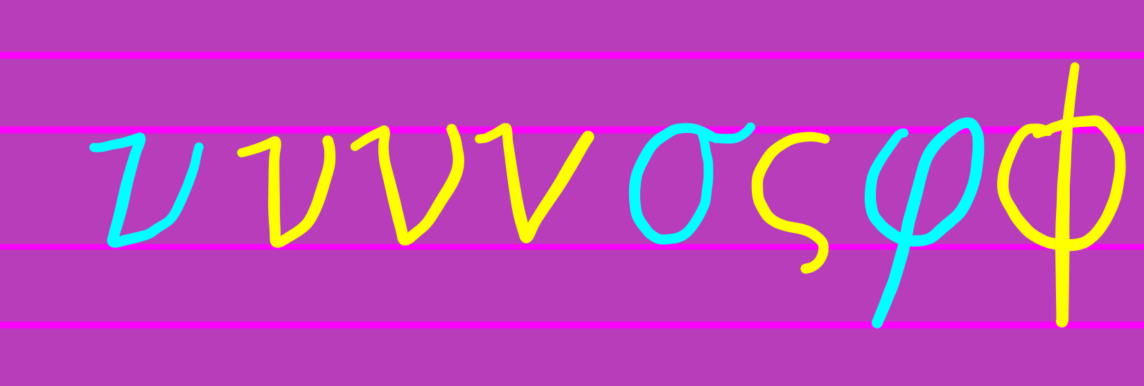
 0, O, and o. Make sure to add a loop on the O and o, because adding a slash to 0, makes it a different one. Small stroke will be a Q, horizontal slash will be a θ, large diagonal slash will be a ∅, and a vertical slash will be a ϕ.
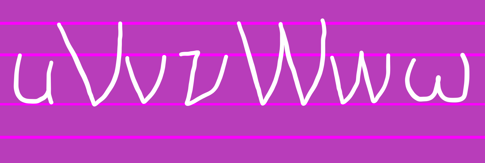 There are letters worth mentioning, like
 u, V v, W w, ν and ω. Make sure to make v like the ν in Lucida Grande, and also apply it for V, W, and w. Make sure to keep ν's left side vertical, add a hook on the left. Keep ω rounded.
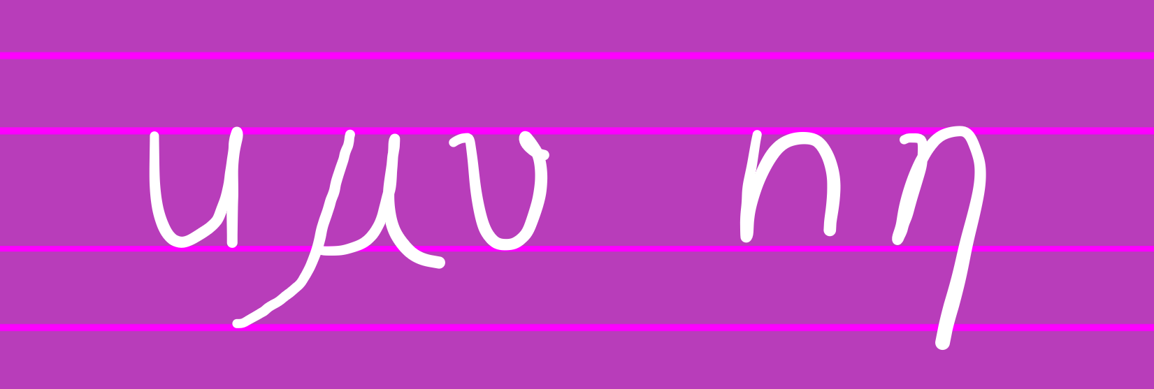 Here are the letters:
 u, μ, υ, n, η. Make sure that μ is in 2 different strokes, υ and η has a curved hook, and μ and η longer than u and n respectively.
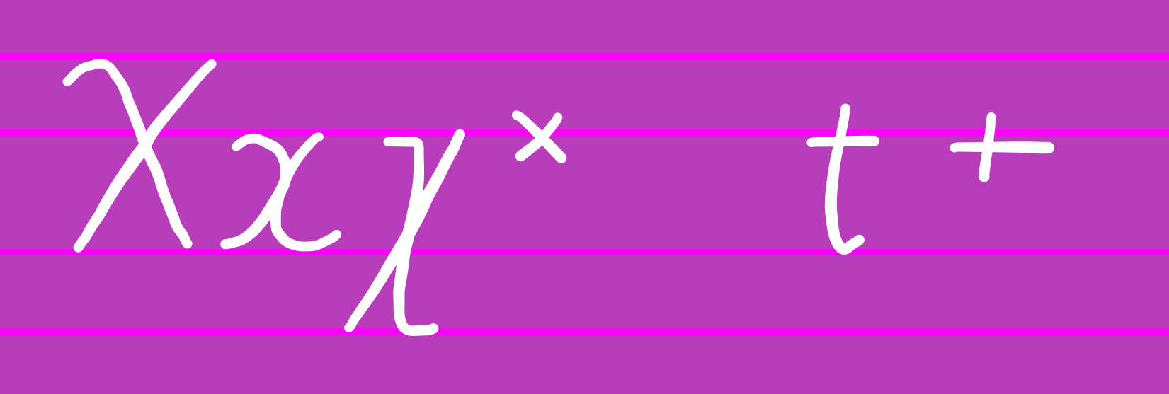 We have
 X, x, χ, and ×, and writing them normally would be confusing. Add a hook to X, make x like two parentheses curved more and joined, χ like in slanted Times New Roman, and × small. We also have t and +. Add a hook to t and make + small.
And that's all!
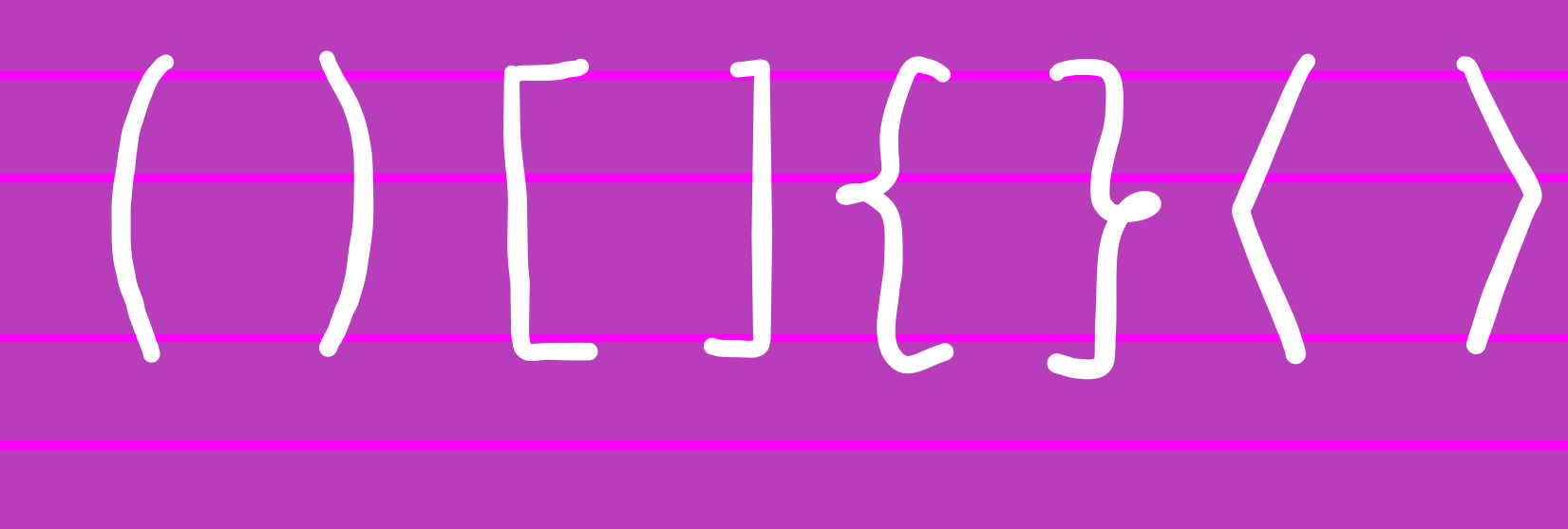
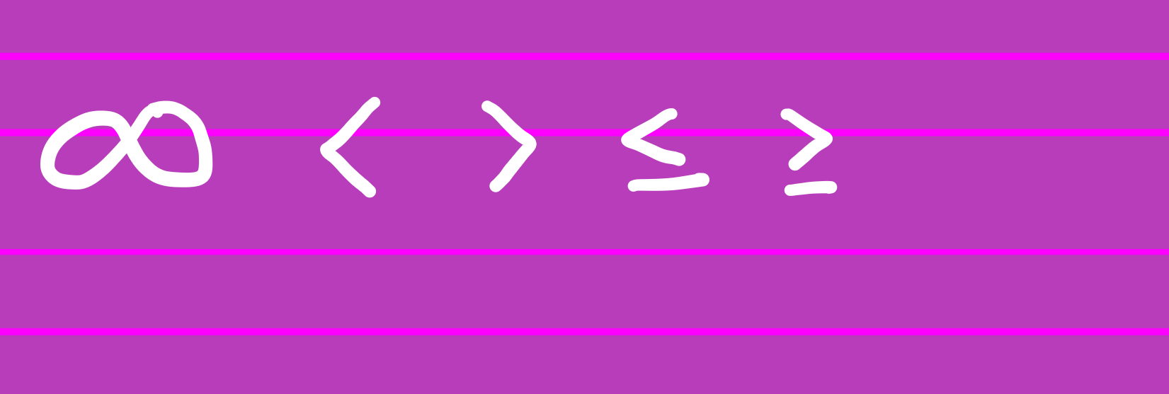
Preview of all of the letters:
Latin Lowercase:
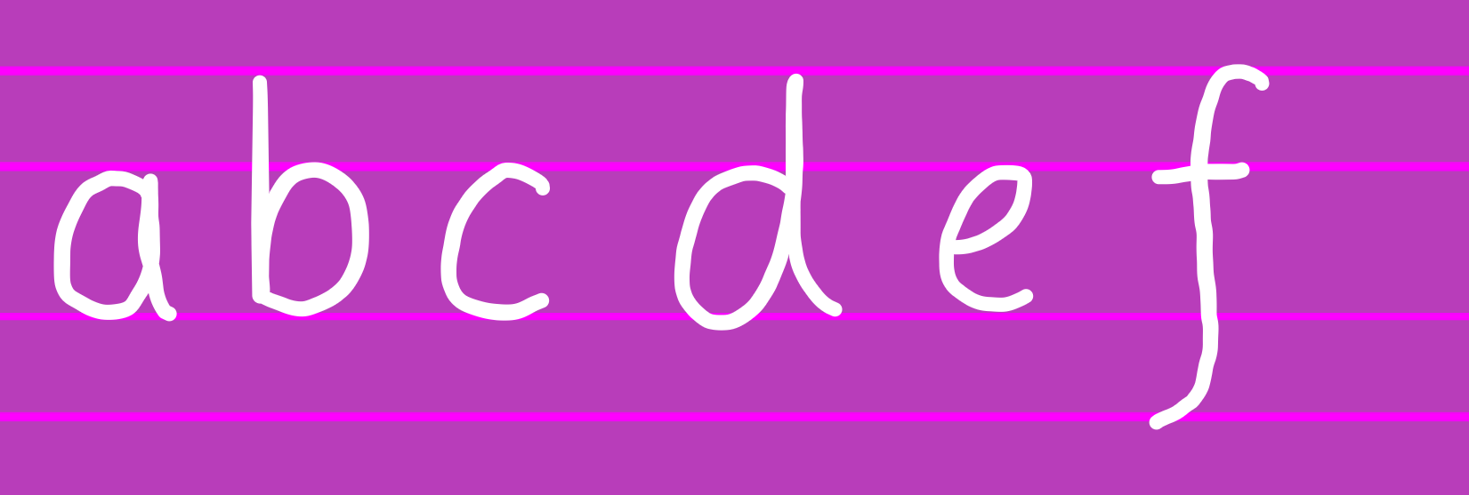
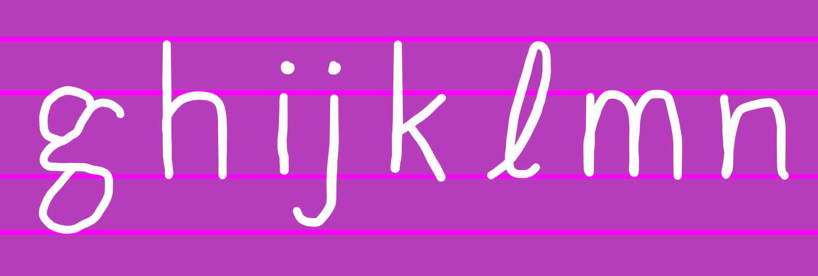
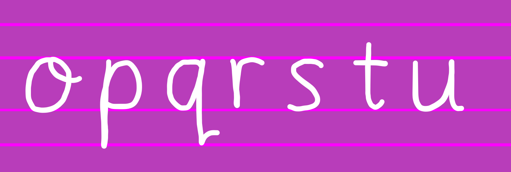
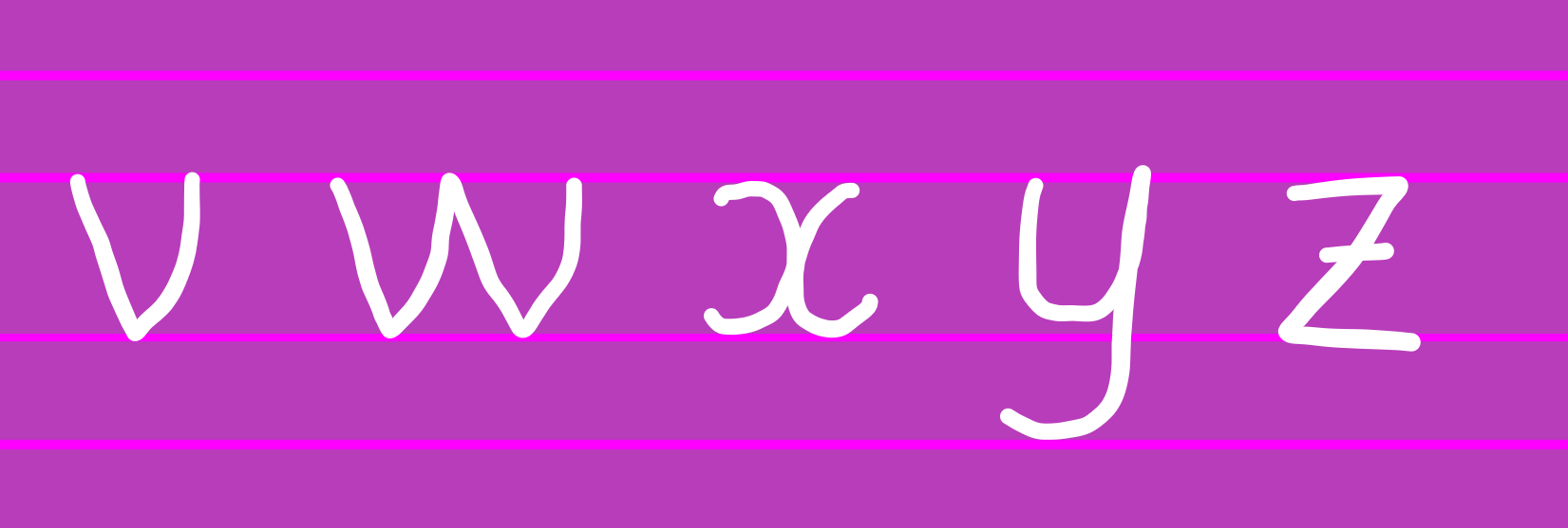 Latin Uppercase:
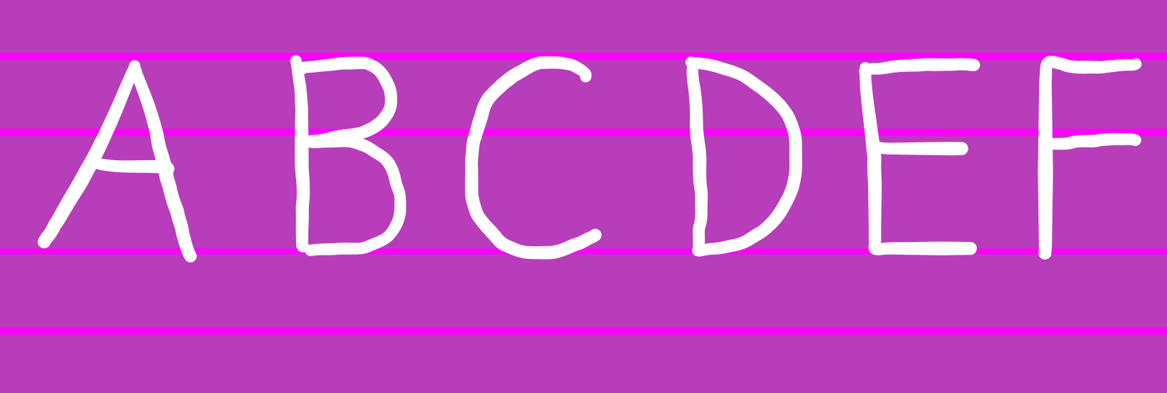
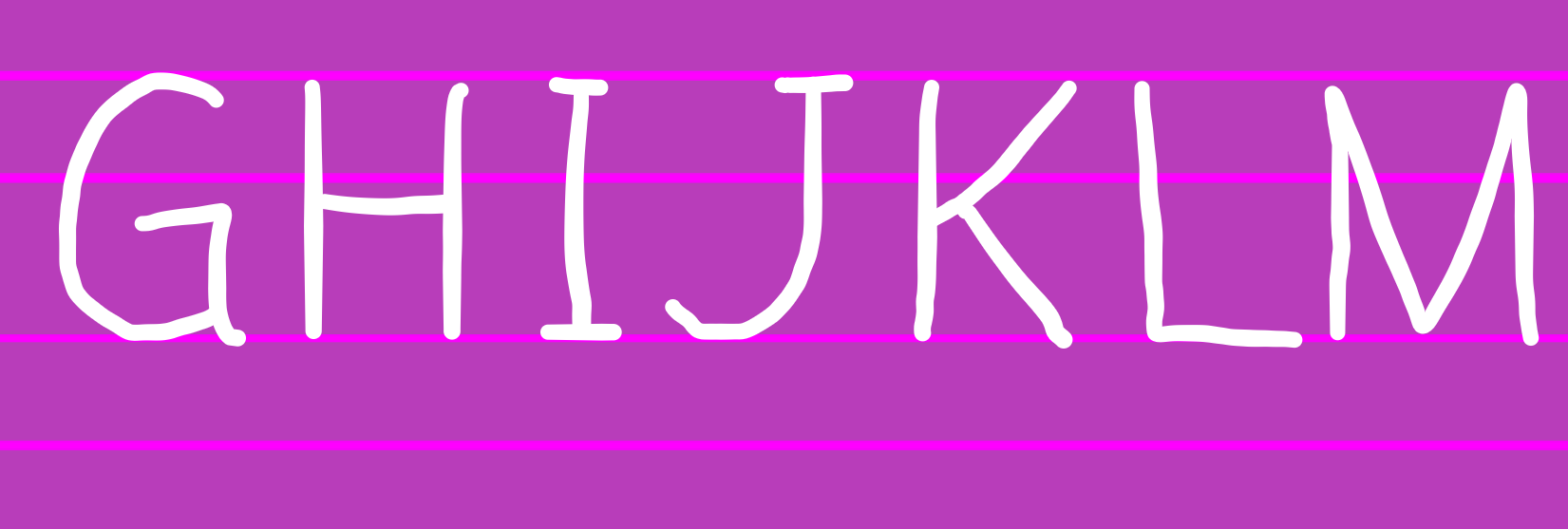
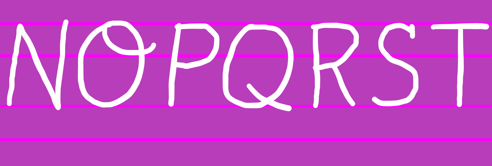
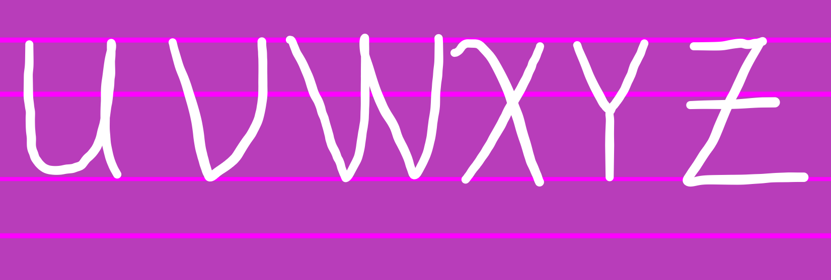 Greek Lowercase:
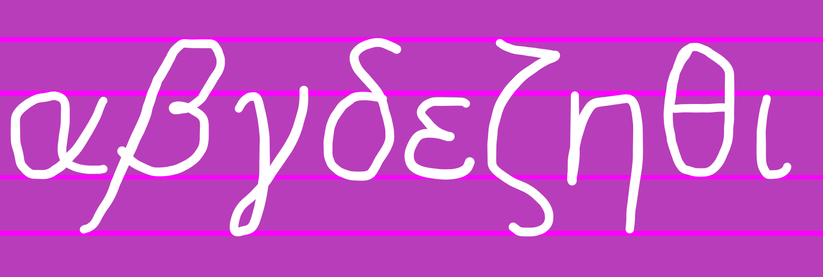
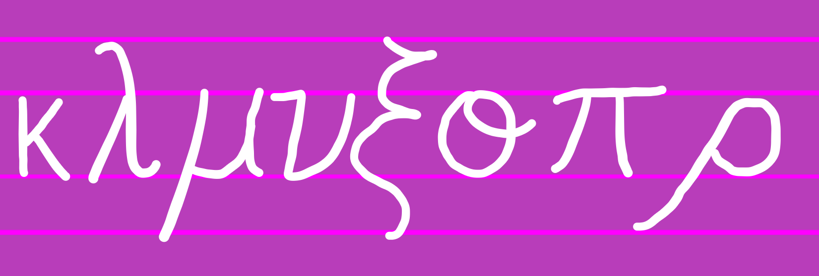
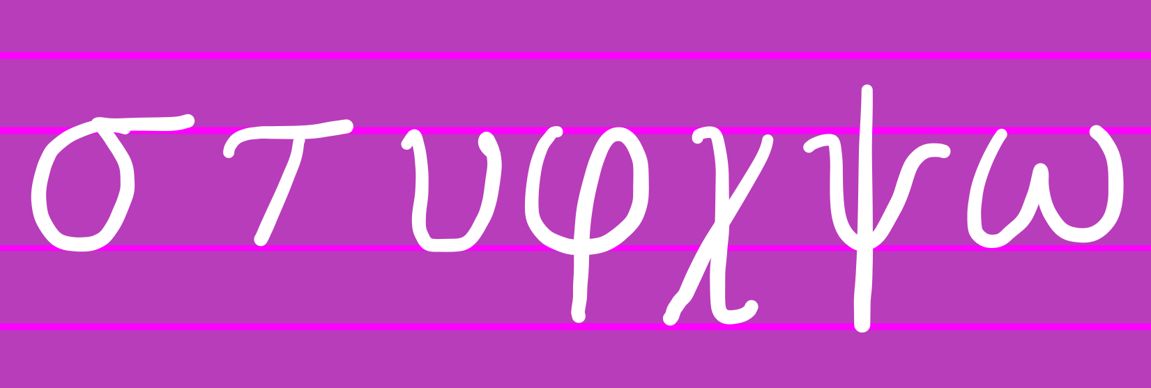 Greek Uppercase:
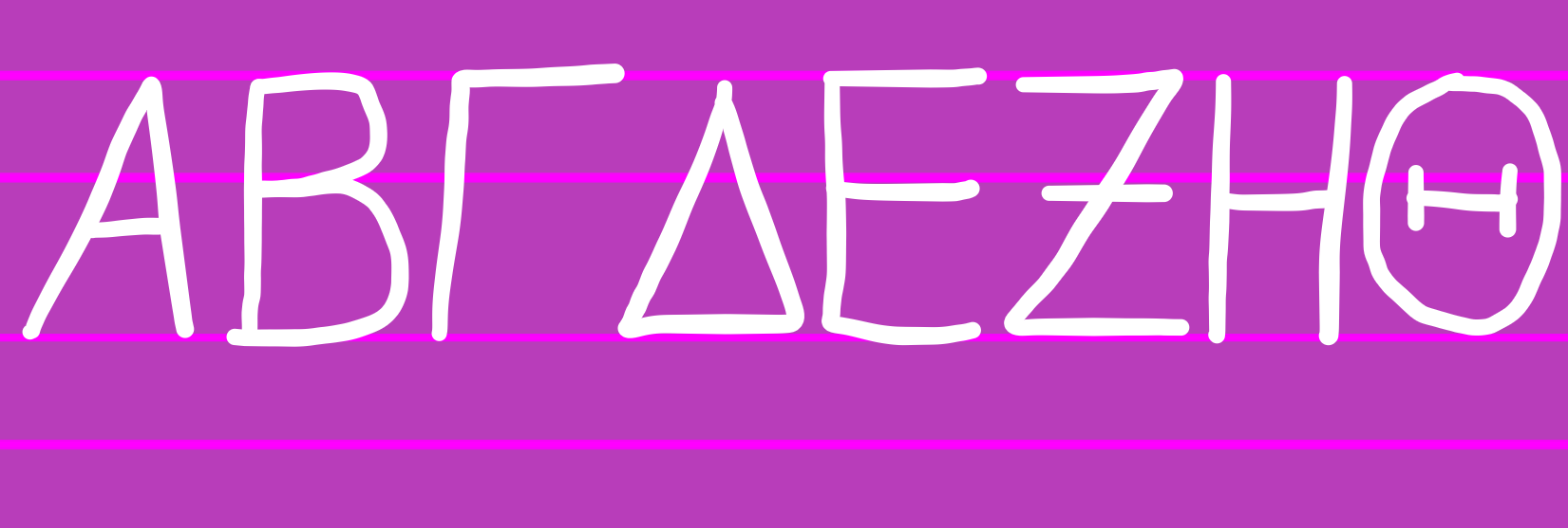
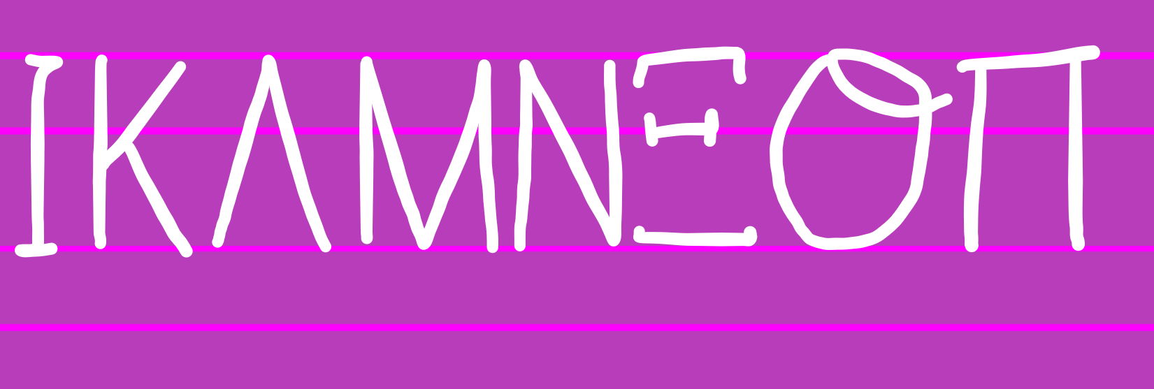
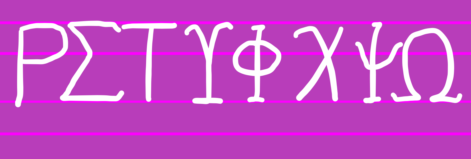 Numbers:
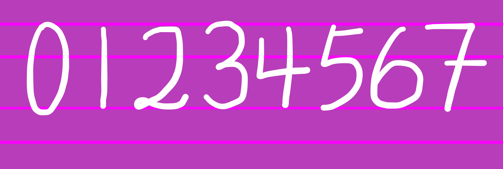
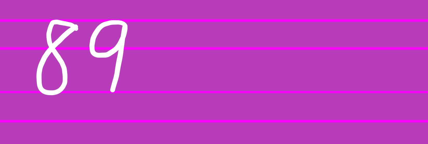 Others:
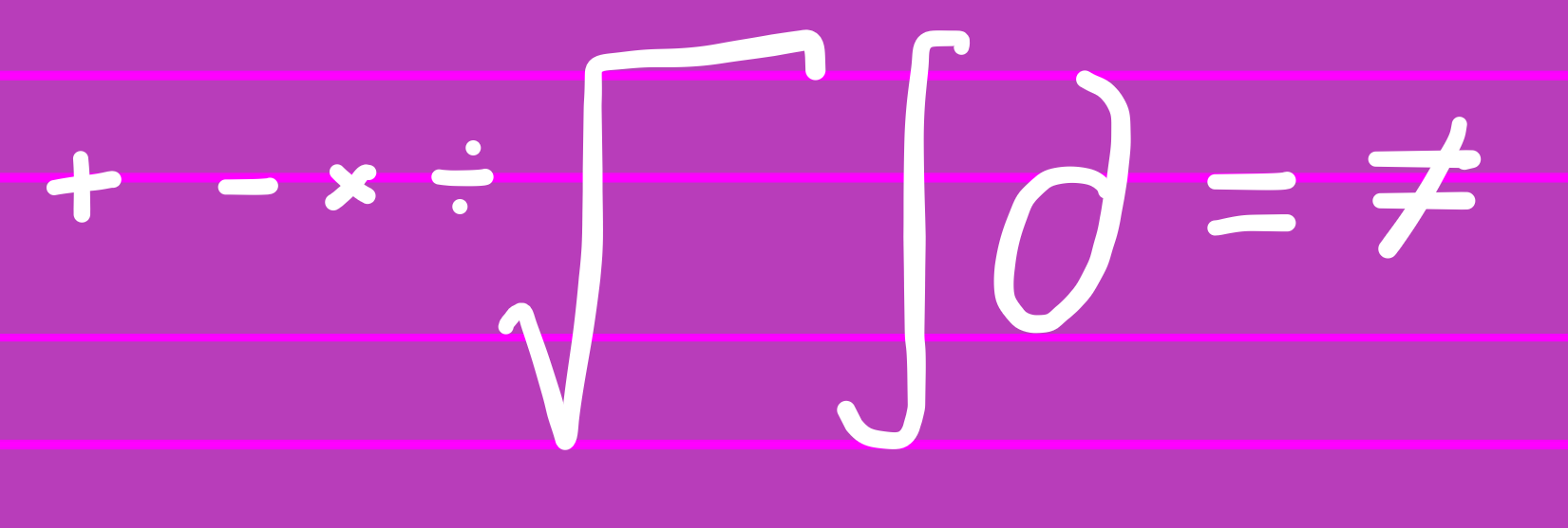
 Common Variations (Original in CYAN, Alternates in YELLOW):
