13
$\begingroup$

I'm a lousy artist. If I want my Gaussian curves to be accurately drawn when I use a whiteboard, or work with pen & paper, what are my options?

Is there a way to use a straight edge, or compass, or some other trick to getting accurate curves from the Gaussian family?

I want to make more symmetrical sketches where the error of any given area under the curve is minimized.

Normal distribution

$\endgroup$
3
  • 2
    $\begingroup$ Gaussian curve = normal distribution. I had to look that up. $\endgroup$
    – Sue VanHattum
    Commented Jan 19, 2022 at 4:51
  • 1
    $\begingroup$ There is of course also some value in your students realising that their diagrams don't have to be perfect, and that it's acceptable when drawing a sketch to compensate for imprecision in the curve by fiddling with the scale on the axes a little. There are always a few students in my experience who allow their perfectionism with diagrams to get in the way of actually solving the problem at hand. $\endgroup$
    – dbmag9
    Commented Jan 20, 2022 at 11:20
  • $\begingroup$ Practice. Like with any art, it's all about practice. Get a small whiteboard and practice drawing gaussian curves for fifteen minutes every evening. Start by tracing if you need a guide. You'll get better. $\endgroup$
    – J...
    Commented Jan 20, 2022 at 15:30

3 Answers 3

21
$\begingroup$

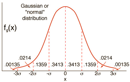
I would put dots where I want 1 standard deviation to be, because I know that's where the inflection points are. (I just graphed $y=e^{-x^{2}/2}$ on desmos, and I see that the inflection points are at a height of about 60% of the maximum, so that's about 3/5ths of the way up. But I didn't do that step back when I taught statistics.)

And then the curve is almost down to 0 at 3 standard deviations. Draw the horizontal axis below, show tick marks from -3 to 3 standard deviations, put in the dots at one standard deviation and about 3/5ths as high at the max, and then draw (thinking about the concavity as you go).

Actually, I think I did practice a lot back then. Because my graphs were sometimes very much not symmetrical. Also, students' graphs are worse, so I gave them a sheet of empty normal curves (6 per side) for them to use. And told them they could have as many copies as they wanted.

enter image description here

$\endgroup$
7
  • 2
    $\begingroup$ I like the approach of fixing a few points and drawing the rest of the curve in, but some numbers are wrong here - at 1 SD, the curve should be at about 2/3 of the max, not 1/3. The inflection points are also closer to 1.5 or 2 SDs, a normal curve is almost linear at 1 SD. The curve looks reasonably normal, but has too little weight in the center. $\endgroup$ Commented Jan 19, 2022 at 16:55
  • 2
    $\begingroup$ @NuclearHoagie You're partly correct. The normal curve with $\sigma = 1$ is $\propto \exp(-x^2/2)$ and the inflection points are at $x = \pm1$. It's confusing when you say "a normal curve is almost linear at 1 SD" since "almost linear" (linear to second order) is what an inflection point means. But I agree the answer is wrong and am downvoting, because it mixes up the correct $\exp(-x^2/2)$ for the inflection points with the incorrect $\exp(-x^2)$ for the height at $\pm1$. The correct height at $\pm1$ is 61% of the peak. $\endgroup$
    – nanoman
    Commented Jan 19, 2022 at 17:32
  • 1
    $\begingroup$ @nanoman Good point, I wasn't using the term inflection point correctly, I was thinking of the "elbow" of the curve where the slope changes fastest (which seems to be what's illustrated in this diagram). The inflection points are at +/-1, but what this diagram shows at +/-1 are not inflection points. $\endgroup$ Commented Jan 19, 2022 at 17:39
  • 2
    $\begingroup$ You're right about the first diagram not actually having inflection points at +-1. I was thinking concave up then down then up as I drew, but having those points too low made it hard to do. (Not surprisingly.) Equation and diagram fixed. $\endgroup$
    – Sue VanHattum
    Commented Jan 19, 2022 at 21:20
  • 3
    $\begingroup$ Great, changed to upvote. $\endgroup$
    – nanoman
    Commented Jan 20, 2022 at 4:35
5
$\begingroup$

One trick for free-handing a more symmetrical bell curve is to draw it in two strokes, each starting from the center point (once right-to-left and once left-to-right).

Perhaps you could make a stencil out of cardboard, which you could trace onto the board.

However, I wonder about the pedagogical value of perfectly accurate drawings. There is an important difference between a "sketch" and a "plot", and they each have their place. I would think that your students are probably not going to be able to reproduce any figures that rely on subtle scaling factors in their notes.

$\endgroup$
1
  • $\begingroup$ FWIW, I tried a normal-curve stencil at one point, with chalk, and after just a single day's use it was miserably chalk-dusted and got on my clothes, pack, papers, etc. $\endgroup$ Commented Jan 21, 2022 at 14:33
1
$\begingroup$

Consider using a tool such as a 'flexible curve' to draw your curves on a whiteboard or paper. It's like a stiff mouldable ruler - you bend it into your required shape and then draw along it.

$\endgroup$

Your Answer

By clicking “Post Your Answer”, you agree to our terms of service and acknowledge you have read our privacy policy.

Not the answer you're looking for? Browse other questions tagged or ask your own question.